Canada’s Global Trade Pivot in Four Charts
This week on Gloves Off, the series has released the first episode of a two-part look at Canada’s economy and the opportunity to thrive in a new world order.
With CUSMA being renegotiated at the moment, Stephen Marche reviews Canada’s trade relationship with the United States and explores what some consider the drawbacks of economic efficiency: making convenient trade deals for short term gain.
Gloves Off Episode 3. How Canada Wins at Trade
Between 2024 and 2025, Canada’s exports to the United States declined by 3%.
A 3% decline in trade to the U.S. may not sound like a lot, but it represents the biggest one-year swing in trade we’ve seen in more than 15 years.
And keep in mind, U.S. President Donald Trump’s trade war with Canada didn’t begin until February 2025, and the infamous “Liberation Day” was in April.
It’ll be fascinating to see whether Canadian businesses continue to shift their trade away from the United States and toward the rest of the world in 2026 and beyond. But already, we can see that Canada is pivoting.
So, what is the shape of that pivot?
Big picture, we’re pivoting to Europe, and a little bit of everywhere else. But it’s important to note that the loss of trade with the United States is not fully offset by other markets.
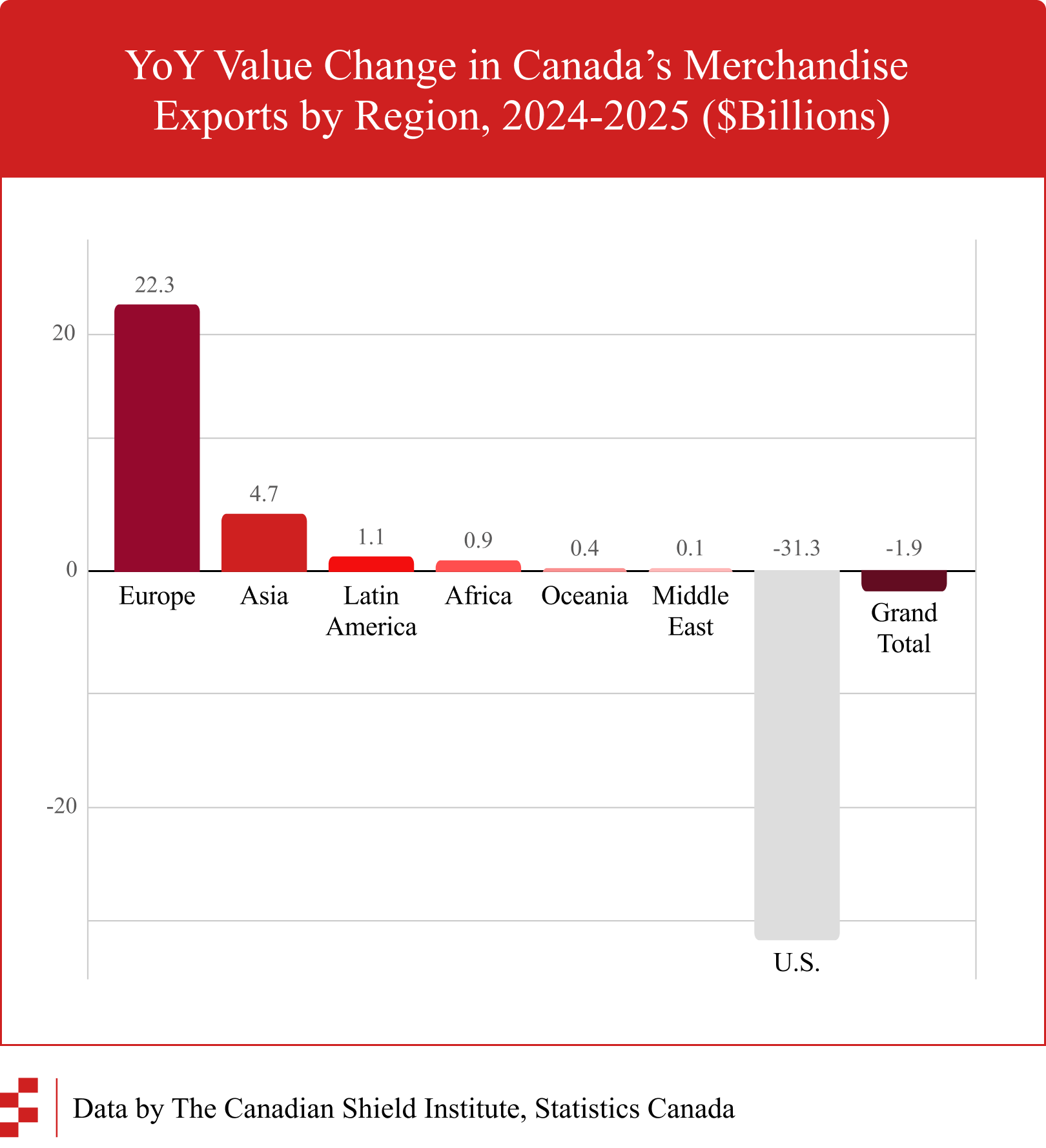
But it’s worth getting into the details now. Because Canada’s economy isn’t a monolith.
Here’s a look at various Canadian economic sectors. The horizontal axis is whether trade has increased or decreased to the USA. The vertical axis is whether trade has increased to the rest of the world.
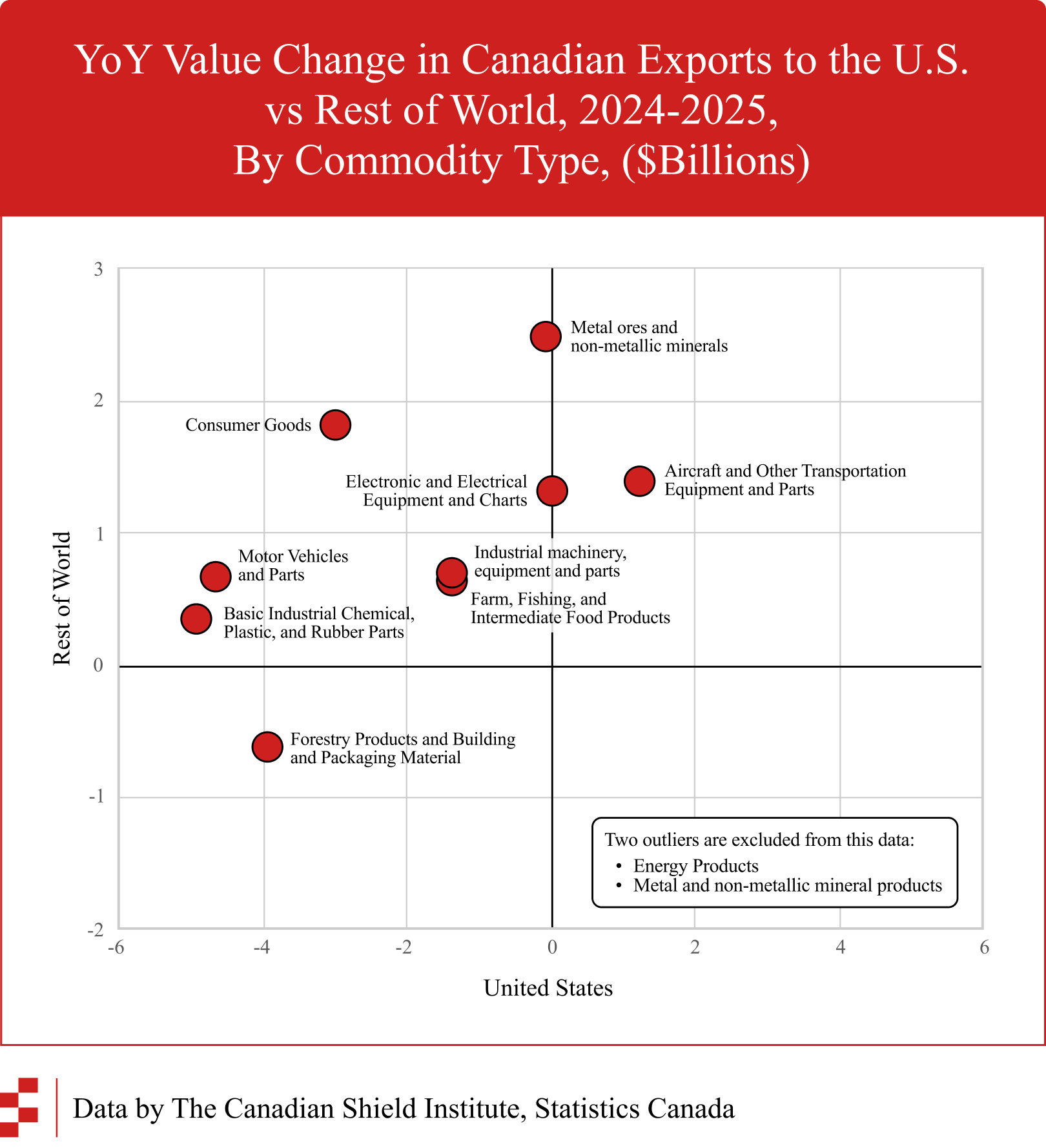
The basic story here is that we’re sending way more stuff to the rest of the world, but the picture of trade to the United States is mixed. In some sectors, our exports are stable or even increasing a bit, in spite of the trade war.
It’s important to note: we had to exclude energy and metal & mineral products from this chart because they were massive outliers.
Energy and minerals were off-the-chart because the decline to the USA was so big. Here are a few of the commodities with biggest declines to the United States.
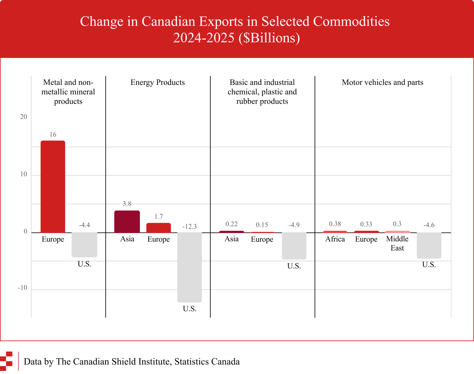
The important thing to understand here is that Canada’s trade pivot isn’t one tidy story, replacing U.S. customers with European or Asian buyers. Metal and mineral product exports are largely going to Europe, our petroleum is going to Asia, and in some cases, declining trade with the Americans isn’t being offset by other markets.
Lastly, we can look at the services sector. If you look back up at the four-quadrant graph of different export sectors, we can see services in the upper right. So basically we’re selling more to the US and also selling more to the rest of the world.
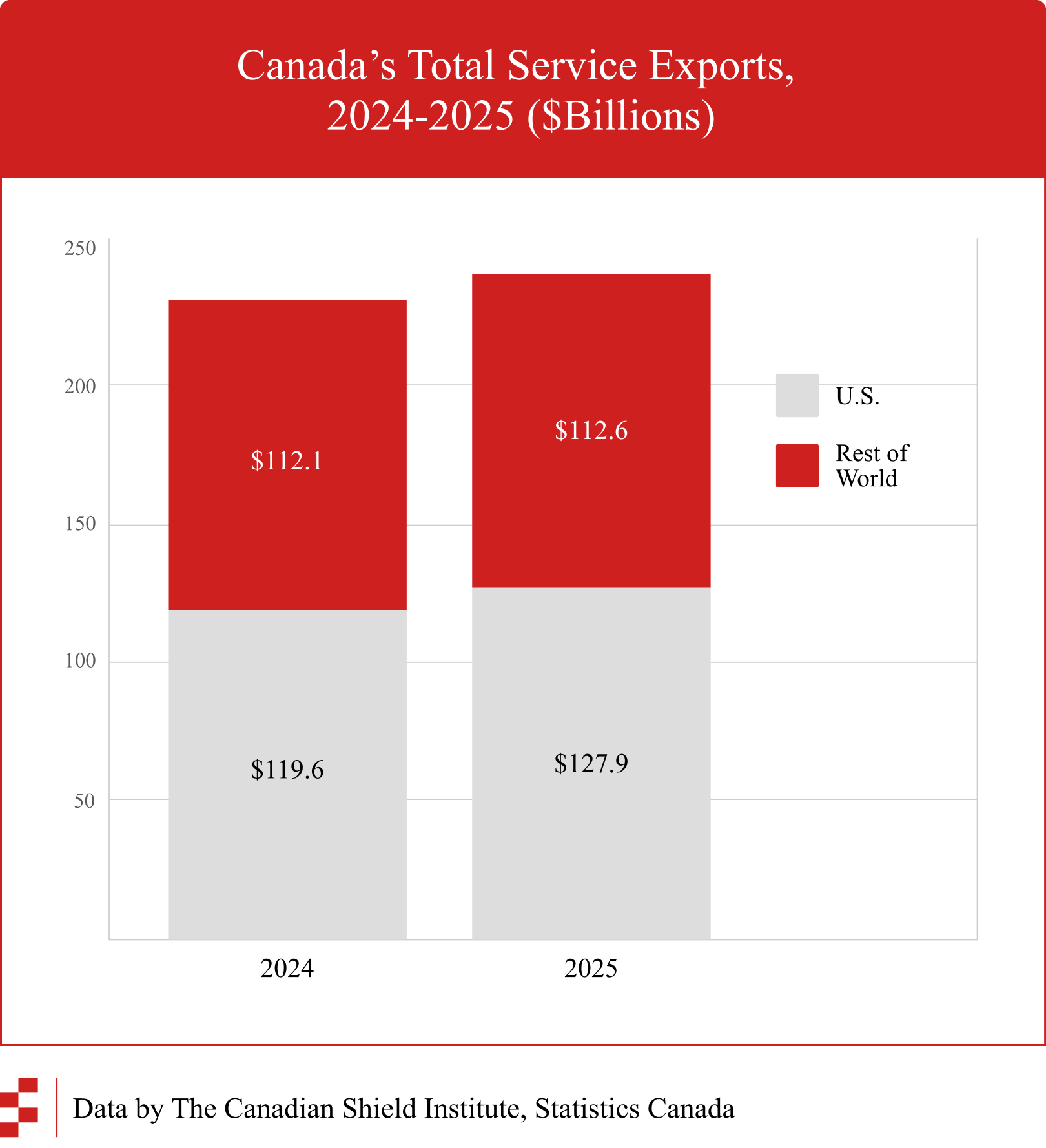
Notably, the proportion going to the U.S.A. is growing, because services trade with the Americans is climbing at a faster rate than the rest of the world.
The services angle is interesting to watch, because that’s where a lot of the digital economy lives. Intangible assets aren’t captured in our trade data in ways that are easy to chart on a graph. Some of it flows frictionlessly across borders through software and digital platforms. But intangibles are also embedded in traditional industries too. We’ve previously written about Canada’s IP payment deficit here.
There’s no one clear upshot from all of this data. What we’re seeing is a world in flux, and by definition, trade data will always lag behind what’s actually happening out there in the global economy.
There’s a lot of complexity and nuance in Canada’s trade flows, and how they’re changing. It’s important to keep this in mind when we track the deals that Prime Minister Mark Carney is signing with countries around the world.
To delve into more of that data, you should poke around in our Variable Geometry map.

Subscribe to